
Creating Entity Dashboard Charts in CRM 2011
Simon Phillips, 04 January 2011
 You may have read in another post I have written, that in CRM 2011 any user now has the ability to create dashboards to display all the data that they would use every day and make looking at multiple entities/records at one time easier. But this isn’t the only way that you can create a dashboard graph. All Dynamics CRM entities can have their own individual graphs that you can use in dashboards or just as a visual aid when you are looking at all the records in a grid.
 Let’s start with how to create these charts (Only people with the security role to edit entities are able to do this), from within the solution window select the entity on which you wish to create a chart for, go to charts and click new in the window that opens select the view from which the data to display in your chart will come from.
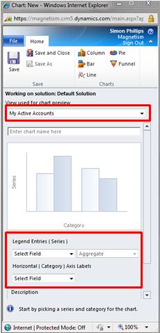
Next you need to decide which fields you are going to use as the x and y axis, and add a description if you desire. You may have noticed that the name of the chart prefilled with the name of the fields that you filtered it with if this name is fine you can leave it like that of you can change it to one of your choice.
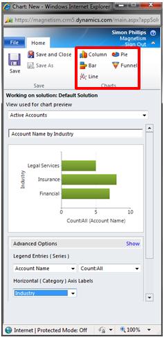
 Finally before you save the chart you can pick which type of chart you wish it to be. Now you can save the chart and publish the changes that you made to the solution, you may now go the entity which you made the chart for and view it.
Category List

Filter by Author
Adam Murchison
Alfwyn Jordan
Arthur Mandisodza
Calum Jacobs
Colin Maitland
David Mochrie
Dominic Liu
Gayan Perera
Harshani Perera
Isaac Stephens
Jaime Smith
Jared Johnson
John Barrencechea
John Eccles
Lauren Withers
Paul Nieuwelaar
Roshan Mehta
Roz Millar
Ryan Blaikie
Ryan Ingram
Sarah Coleman
Sean Roque
Shalane Williams