

Intelligent Dashboards in Microsoft Dynamics CRM 2011
Roshan Mehta, 09 December 2010
With the release of Dynamics CRM 2011 comes a fantastic new dashboarding feature which allows the end user to create their own dashboards, and also interact with them in order to drill down into important data. Firstly, let’s take a look at what the dashboard looks like.
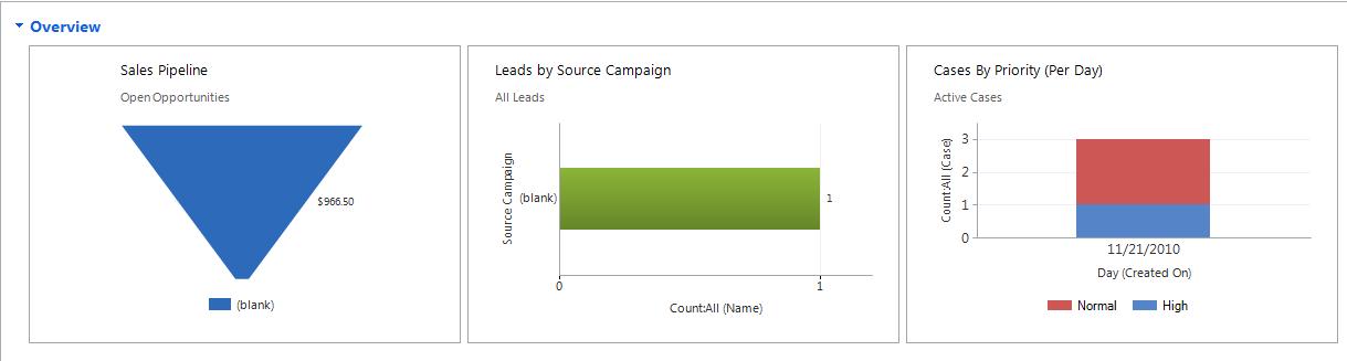
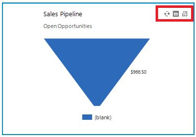
The image above shows three charts which have been created inside CRM 2011. Pretty eye-catching if you ask me! But that’s not all. When you hover over each chart, you are presented with three buttons which allow you to refresh the chart, view the records which were used to generate the chart, and enlarge the chart.
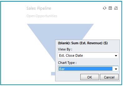
Now here’s where the real intelligence begins. I can further drill down into this chart simply by clicking on it, and selecting the data I wish to display in a new chart. I can also specify the chart type to use for the new chart. Let’s say I want to view the estimated revenue as well as the estimated close date for all open opportunities in a bar chart. I can do this easily by selecting the options displayed below.
After pressing OK, I am presented with a brand new chart.
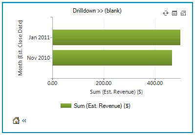
Again, I have the option to view the records which generated the chart, and also drill down even further using any chart type. I can also return to the previous chart or to the original chart by clicking on the “home” icon.
The dashboarding capabilities go even further than this, as you can now create your own dashboards using the out of the box customization features. With this I conclude by saying that Dynamics CRM has truly come to life with this powerful, yet easy to use functionality.
To find out how to setup your own dashboard, take a look at Simon Phillip’s blog – Microsoft Dynamics CRM 2011 Dashboarding 101.
Category List
Filter by Author
Adam Murchison
Alfwyn Jordan
Arthur Mandisodza
Calum Jacobs
Colin Maitland
David Mochrie
Dominic Liu
Gayan Perera
Harshani Perera
Isaac Stephens
Jaime Smith
Jared Johnson
John Barrencechea
John Eccles
Lauren Withers
Paul Nieuwelaar
Roshan Mehta
Roz Millar
Ryan Blaikie
Ryan Ingram
Sarah Coleman
Sean Roque
Shalane Williams