New Dialog Builder PCF Custom Control for Dynamics 365 AppSource
Paul Nieuwelaar, 20 July 2020
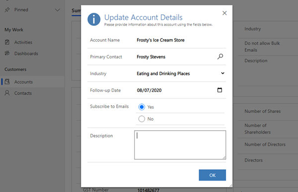
Our Dialog Builder app (formerly Alert.js) was recently re-approved for Microsoft AppSource, and with it comes a new PCF Custom Control that allows you to build dialogs right from within the custom control UI, without having to write any custom code.
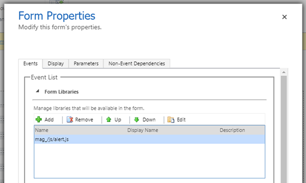
This PCF control is exclusive to the AppSource version of Dialog Builder and must be added at least once on any forms using the Dialog Builder solution. After adding the PCF control to your form, and referencing the mag_/js/alert.js library from your form properties, you can start building your dialogs using your own custom JavaScript as you’ve always been able to in the past, or you can use the power of the new PCF control to build out your dialogs directly from within the custom control.
Initial Setup
The first step is to install the latest solution from AppSource. This solution will include the Dialog Builder custom control which is only available in the AppSource solution. Click the free trial button to install the solution into your environment.
Once the solution is installed, we recommend installing the full solution from GitHub over the top. Doing this makes the solution unsupported but restores some of the functionality which is not possible in the AppSource version (such as using the solution from homepage views by removing the dependency on the custom control). This is not recommended if you want to maintain a Microsoft supported solution. The standalone AppSource version still works 100% from Dynamics 365 forms but requires the custom control to be added to each form that needs to display dialogs.
Once the solution is installed from AppSource, you can start using the solution by adding the mag_/js/alert.js JavaScript library to your form properties. This will initialise the Dialog Builder solution for the form, allowing you to create dialogs via custom JavaScript, or using the custom control.
If you’ve installed the GitHub solution over top, then you can start calling into the Dialog Builder functions from your custom JavaScript to create dialogs. Otherwise if you only have the AppSource version installed, you’ll need to add the Dialog Builder custom control to the form.
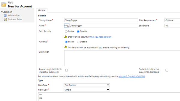
Start by creating a Two Options field to bind the control to. This field can be used as just a placeholder field to host the custom control, or as a trigger point for manually popping each configured dialog.
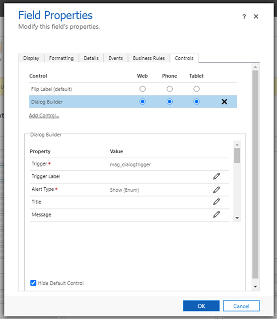
After adding the Two Option field to the form, you can configure the fields properties to use the Dialog Builder custom control.
Once the control is bound, you can simply leave the control properties blank if you intend to create all your dialogs from custom code. This control can either be hidden and only used to initialise Dialog Builder for your custom code, or you can configure the control properties to create a fully customisable dialog without having to write any code.
Configuring the Custom Control
The properties for the custom control closely match the documentation for Dialog Builder when being used from code.
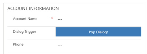
When the control itself is visible on the form, it will display as a button which manually triggers the dialog to display. You can set the Trigger Label in the control properties to customise the label on this button. This button can also be hidden simply by setting the field properties to be hidden by default, if you intend to programmatically trigger the dialog.
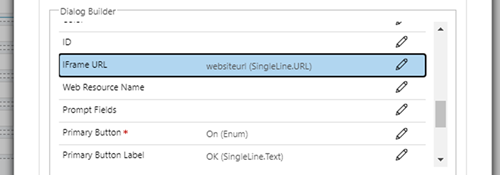
Depending on the “Type” of dialog being used, there are some additional options for configuring the Iframe URL (used with Show Iframe), the Web Resource Name (used with Show Web Resource), or the Prompt Fields (used with Show Prompt). These can be static inputs or bound to a field to dynamically pop a Website URL as an Iframe, for example.
When creating a dialog through the custom control, you can specify up to 2 buttons to display on the dialog. This limitation does not exist when creating dialogs from code.
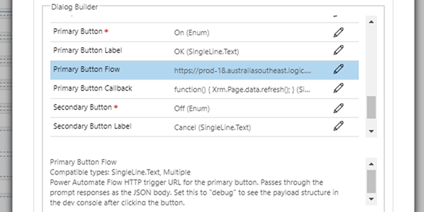
From the custom control you can configure the Primary Button properties, including whether to display the button (On or Off), the label for the button, and optionally a callback function to execute custom code when the button is clicked, or a Power Automate (Flow) URL to send the response data to, which you can then use to process the responses via Power Automate.
If specifying a Flow URL, you can also specify a callback function to execute after the Flow completes, to refresh the form for example.
You can also configure the secondary button with the same properties as the primary button.
The Button Callback’s can be either an inline JavaScript function, e.g. to refresh the form: function() { Xrm.Page.data.refresh(); } – or you can specify the name of a function loaded by your own web resource, e.g. if you have a namespace: MyOrg.dialogCallback.
Further examples on how to set up a Flow to capture and process the responses will be covered in a future blog post.
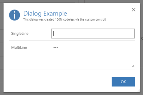
Once you’ve finished configuring the custom control properties, you can test the dialog. If your control is visible on the form, you can simply click the trigger button within the control to pop the dialog.
If your trigger button is hidden, and you wish to trigger the dialog automatically from code, e.g. from a form event, or from a ribbon button, you can simply set the value of the Two Option field to true for the field which the control is bound to.
formContext.getAttribute("mag_dialogtrigger").setValue(true);
This will trigger the custom control to display the dialog and will then reset the field value back to false.
That’s all there is to it. Using Dialog Builder, we can now build custom dialogs and popups without having to write any code, and we can safely use this in our solutions knowing that it is 100% supported by Microsoft. We can also continue using the full features of Dialog Builder through custom code if we need to. This solution is available now on AppSource and GitHub. There is also a range of new features included in the latest version, so be sure to check out the release notes.

