How to Configure Age Groupings in Power BI
Nick Chin, 20 April 2020
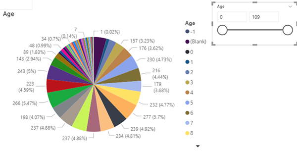
When designing reports in Power BI, you need to be aware of situations where your visualizations may be hard to read due to the large range of data you have available. For example, the pie chart below shows information segmented by different ages, but each slice of the pie is very small and is difficult to read.
Rather than relying on individual pieces of data, you can use the SWITCH function in DAX to group the ages into more digestible chunks.
DAX:
SWITCH(<expression>, <value>, <result>[, <value>, <result>]…[, <else>])
For more information about the Switch function go to: https://docs.microsoft.com/en-us/dax/switch-function-dax
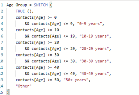
I decided to group the age data into lots of 10 using the following expression.
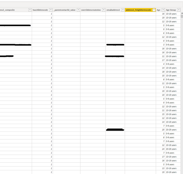
Below is an example of how the grouping was applied to Contacts.
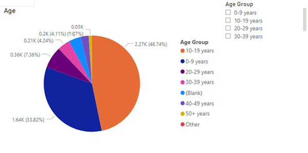
Now I update Power BI to use the “Age Group” for the Legend instead of “Age” and the data is significantly more readable and easier to interpret.


