New User Interface features in the Dynamics 365 2021 Release Wave 2
Harshani Perera, 29 September 2021
The 2021 Release Wave 2 for Dynamics 365 which will be rolled out from October 2021 through to March 2022 comes with several new features for the user interface that are quite nice. Following are some of the highlights listed below. I have also provided a few videos which explain the features in more detail.
1) The Column Editor
This allows you to add, remove or re-order the columns in a view.
The edited view is temporary so if you would like to use it again, you can save the view easily from the user interface as well.
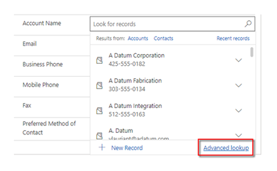
2) Advanced Lookup
Advanced lookup is available on forms now which will allow you to search for records more easily and see more detail.
3) Move Subgrid columns
You can now move the columns left and right in a subgrid easily by using the buttons shown below or click and drag the columns as well. The changes will be lost if you log out or close your browser session however it will remain while you are logged in even if you navigate away from the record.
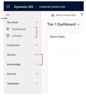
4) Improved Sitemap
The Sitemap allows to expand and collapse the groups which allows to scroll more quickly through the navigation. You can also hide the Home, Recent and Pinned items. This feature is not yet available in the preview, so this is only a screenshot.
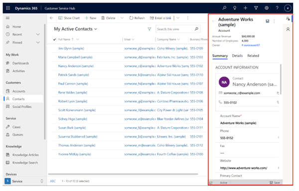
5) Multiple side panes
You can have multiple tabs on the right-hand side each with a different pane. Again, this feature is also not available in the preview and is only a screenshot.
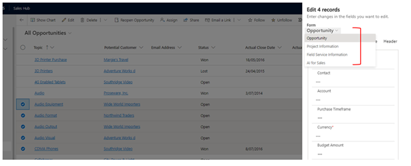
6) Multiple Edit
This is a much-improved version of the previous edit interface and displays the unified interface form in a side pane where you can update/select data. You also have the ability to change the form as well.
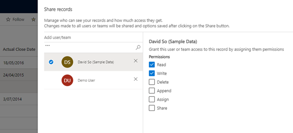
7) Share Records
This is also an improved version of sharing records which now has a unified interface. The Share records pane will open on the right-hand side. You can then search for the users and give each user their own permissions.
Note: The previous interface shows the users who previously had been shared the record with their permissions but this does not seem to show in the new interface.
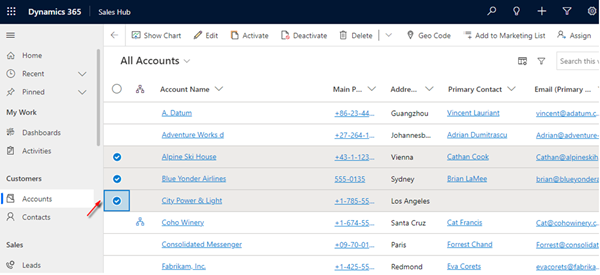
8) Tick boxes to select records
The tick boxes make it much easier now to see the records you have selected.
9) Styling for Scroll bars
The scroll bars have been updated to use a thin, rounded styling so it’s consistent with other Microsoft products.
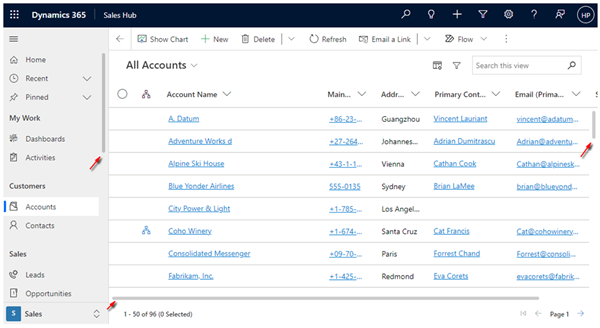 Note: Firefox browser does not seem to show this change in the preview currently.
10) Updated Column Views
The styling of the columns in the views have been updated.
Note: If you do have a lot of columns in a view, the names of the columns could become truncated.
As you can see, this release has quite a lot of good changes to the user interface and navigation so hope you gain benefits from these features.


