Why I Love the New Microsoft Dynamics 365 V9 Unified Interface and You will too
Harshani Perera, 24 May 2019
I'm usually resistant to change due to the fact that I may take longer than others to learn new things so I prefer to stick with my familiar ways. It’s easier and faster to work with what you already know and are familiar with, right? If a new system or an app takes me a long time to figure out, most likely I will abandon it out of frustration or time consumption. I am sure most of you will agree with me that we all prefer to use applications that make our work easier rather than more complicated.
Now, I was happy with the Classic version of Dynamics 365. When I was asked to test for a Client who was moving to the new Unified Interface, I dreaded having to learn my way around a new application again but I was blown away by this new UI within minutes, a rare occasion for me.
The Unified Interface was like meeting someone new for the first time yet somehow feeling like you already know them. As soon as you enter the new UI and start playing around, you will almost instantly feel a sense of familiarity and intuitiveness. It feels like you already know your way around even though you have never used it before. I didn’t really need to ask or look for things as I could intuitively pick up where things would be and find my way around easily. Why wasn't I complaining more?
The following are just some of the few features that I have discovered and come to love in the new Unified Interface.
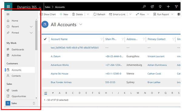
Left Navigation
Here you can easily switch between entities, records, activities, dashboards etc. It is quite compact and thus takes up less time in moving between different sections.
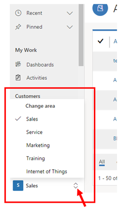
Switching Areas
You can switch between the different Areas of CRM i.e. Sales, Service, Marketing by clicking the arrows which will pop up the area you wish to move to.
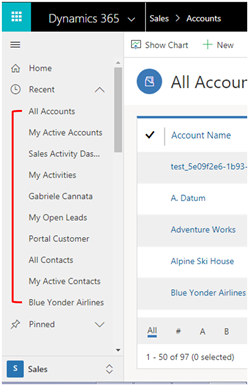
View Recently opened items
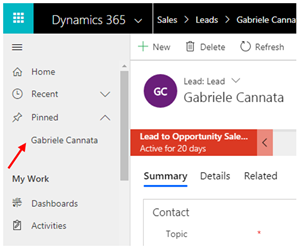
In the Recent Section, you can view your recently opened records quickly and easily by clicking the ^ symbol.
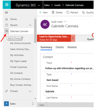
Pin Items to the Navigation bar
If you have records that you need to keep coming back to, you can pin these to the Navigation bar for later access by clicking the Pin on the left next to the record in the Recent section.
Once pinned, the record will appear in the Pinned section.
Compressed Navigation
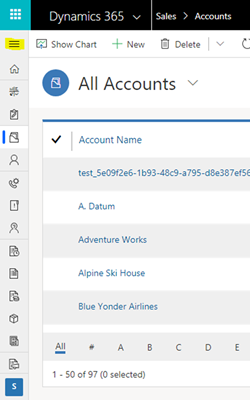
If you need more space, you can always compress the Navigation by clicking the collapsed menu icon on the top left.
Timeline
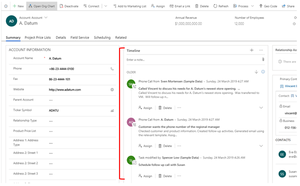
The Timeline section in the middle allows you to easily view all communication for that record such as emails, tasks, posts, notes etc.
Working with One Screen
You will no longer have multiple windows popping up when working with records. You won’t need to switch between records either as the Unified Interface easily allows to do all your work in one screen.
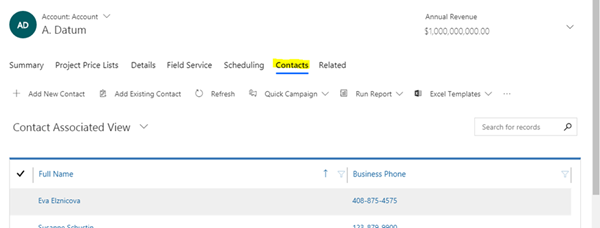
The Navigation on the Form swiftly allows you to move to different sections of the form rather than scrolling down the page.
If you select a related entity, this will show in the Navigation for later access again.
Seamless Design
To me, the new UI design is seamless. It just makes better use of space and fewer clicks and movements are needed when navigating the interface. You pretty much have everything you need within the screen.
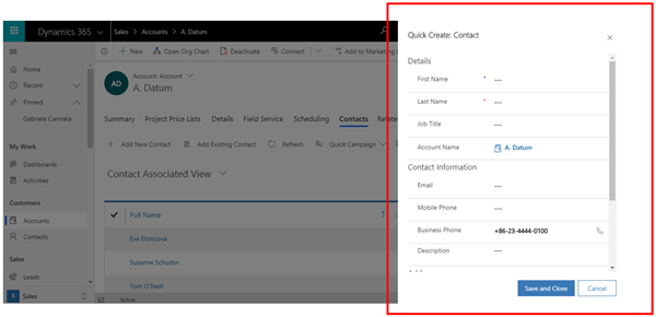
When using the Quick Create or Adding a New Record from a related entity, a window will pop up on the left to add the data without moving you away from the main screen. The background screen will darken so that you can focus on the current task.
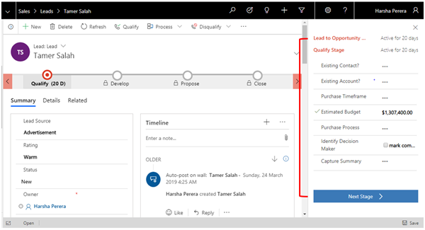
The Business Process flow takes up less space leaving you room to view more information. When you click on the stage, it expands into a small screen to fill out the information and will disappear once you click out of it.
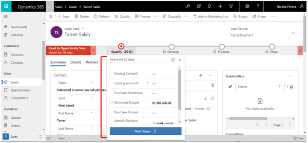
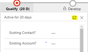
If you prefer to have a more steady display to work with, click the square icon for the flyout which will display on the right.
The following are the Main sections in navigating the UI: 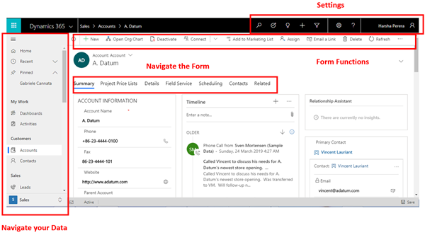
The new UI, moves with you. If you move to a smaller screen, it resizes but still shows you the relevant information. If you switch to a bigger screen, it shows you more information.
Some highlights
This blog wouldn’t be complete without the mention of Advanced Find, the new Refresh button and Settings.
The Advanced Find can be found on the top right.

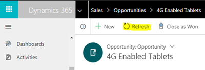
The Refresh Button is available on the Command Bar of the Form. You can refresh the form now using this button rather than the browser.
If you are puzzled about where the Settings Section has gone for customizing etc., this can be found by selecting Advanced Settings from the Settings button.
There’s more to be discovered and this is just the start. Far greater things are on the way from Microsoft and I am on board the train. Are you?

