Optimising the Calendar Control for Opportunities
David Mochrie, 25 January 2019
The new(ish) Unified Interface for Dynamics 365 Customer Engagement comes with a whole stack of nice features. One of these is the calendar control. This has of course been around in the tablet and phone clients for a while now, but now we have the Unified Interface, I decided to take a closer look at it.
On the Opportunity entity, the calendar control is enabled out of the box. This is an often-requested feature from customers. Their sales teams want to see how when opportunities are due to close on a calendar. Out of the box, the calendar control looks like this:
It defaults to the week view, and you’ll have to scroll up to the 12am slot to see the Opportunities. Also, with them horizontally laid out like this, most of the name of the Opportunity is hidden, and there’s not even a tooltip that appears with the full name when you hover over it.
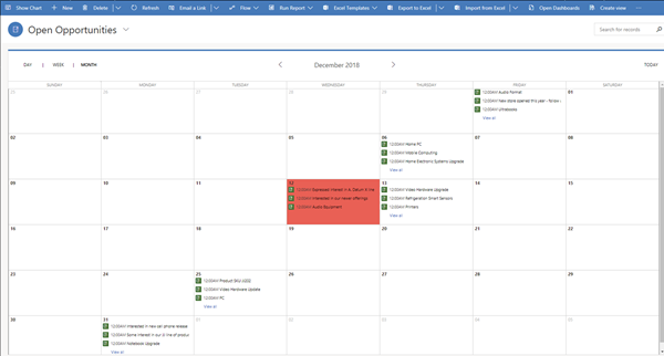
Also, on the month view, all the opportunities are prefixed with ‘12:00 AM’:
This is because although the Estimated Close Date of the Opportunity displays as a date only, the field still has a time element, which defaults to 12am.
Also, there’s no indication on which customer the opportunity is for. The field shown is the name, i.e. the ‘Topic’ field.
All round, this is not a nice user experience, so I decided to see if I could improve the calendar control for Opportunities by changing the configuration.
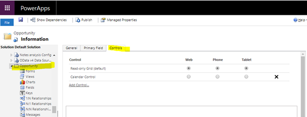
The calendar control is an entity level control, accessed through the Customizations module:
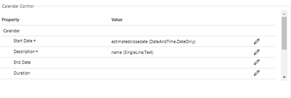
The default settings are:
I created a field called ‘Concatenated Name’, and created a workflow to populate it with <Potential Customer> : <Topic>.
I then set the ‘Description’ for the calendar control to be this ‘Concatenated Name’ field.
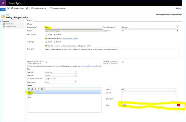
I also changed the ‘Display mode’ to be ‘Stacked events (Enum)’, and set the ‘Color’ to be the ‘Rating’ of the Opportunity, i.e. hot, warm or cold. I then set each of these options to have a specific color, red being hot, yellow being warm and blue being cold.
So, when I was finished configuring the calendar control, the settings looked like this:

The highlighted parts are where I changed it.
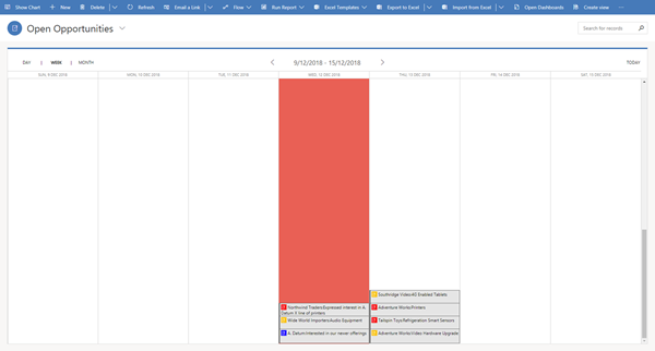
After saving and publishing the changes, the calendar control for Opportunities now looks like this:
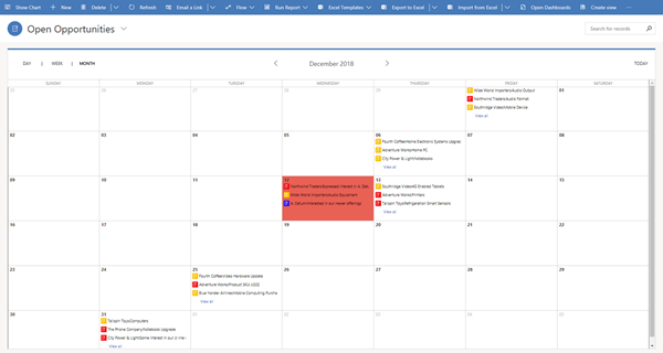
And on the monthly view:
So, the improvements are:
• No more scrolling on the weekly view
• You can now see which customer each opportunity is for as well as the Topic
• The ’12.00AM’ is no longer on the monthly view
• The colour of the icon reflects the hot, warm or cold rating of the opportunity
Please note, I could have used any option set field as the colour. I just used Rating as an example.
Incidentally, I couldn’t get the Opportunities to show on the Day view at all, regardless of the configuration settings of the calendar control. I think this is a bug. Let’s hope Microsoft fix it soon.
Anyway, that’s how I optimised the calendar control for opportunities.
Happy CRMing everyone!


