How to use a calculation group to change a relationship in Power BI
Colin Maitland, 23 February 2023
In Power BI, Calculation Groups act as a filter that modifies the measures they are applied to. The use of a Calculation Group reduces the number of measures that need to be written to support multiple calculation scenarios.
In this article, I demonstrate how a Calculation Group may be used to change which relationship is used by a measure. This approach is applicable when there are multiple relationships between a dimension table and a fact table, and sometimes the measure needs to use any one of these based on the report scenario.
I am using an example based on reporting email events such as sends, deliveries, opens and clicks for bulk email marketing campaigns. The following image shows an example of the email events for a specific email message. The email message was first processed and delivered on 1/7/2022 but was subsequently opened and clicked on other dates.
In this example, I want the same measures to be sometimes filtered by the email event date and sometimes by the first processed date. The number of email events when filtered by date will differ based on the selected date range and on which of the two date columns is used by the measure when it is calculated.
Step 1: Data Model Configuration
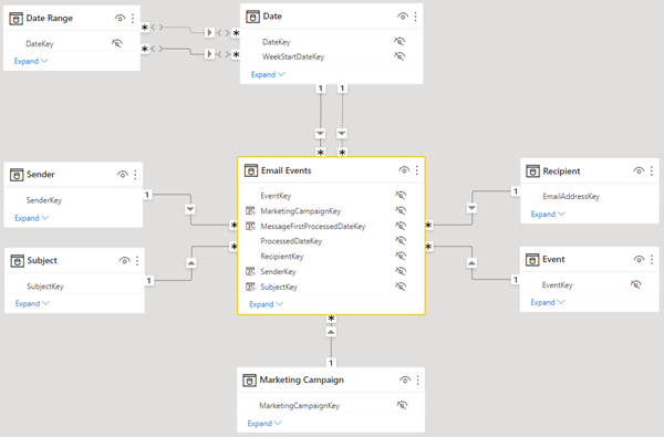
This is the data model.
The most important tables and relationships for the purposes of this demonstration are the Date and Email Events tables and relationships.
There are two relationships from Date to Email Events. There is an active relationship from Date to Email Events ProcessedDateKey and there is an inactive relationship from Date to Email Events MessageFirstProcessedDateKey.
In this data model, Email Events are filtered by Date, Event, Marketing Campaign, Sender, Subject, and Recipient.
In addition, Date is filtered by Date Range. Using a Date Range slicer, the user of a report can select a Date Range to report against such as This Month, This Week or Last Week etc.
Report Example 1 – Email Messages by Email Event using Processed Date
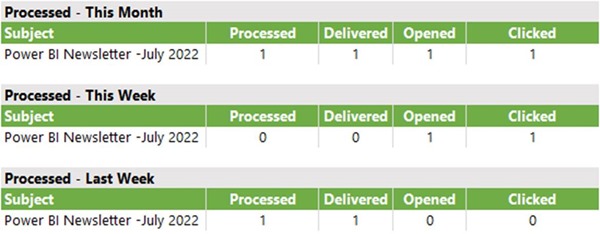
This is an example of a report that calculates the number of Email Messages by Event for three selected Date Ranges, i.e., This Month (July 2022), This Week (3rd – 9th July 2022) and Last Week (26th June – 2nd July 2022).
The purpose of this report is to show how many Email Messages have a related Event where the Processed date of the event falls within the selected Date Range. Therefore, the calculations displayed by this report use the relationship from Date to Email Events ProcessedDateKey. A Calculation Group is used to select this relationship.
Report Example 2 – Email Messages by Email Event using Message First Processed Date
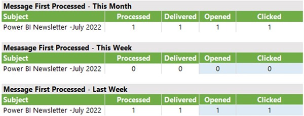
This is an example of a report that performs the same calculations for the same date ranges but uses a different Date to Email Event relationship.
The purpose of this report is to show how many Email Messages have related Events where the Message First Processed date of the event falls within the selected Date Range. The calculations displayed by this report use the relationship from Date to Email Events MessageFirstProcessedDateKey. A Calculation Group is used to select this relationship.
You will notice that in some places, highlighted in blue, these two sets of reports display different results. In real life, the results could be the same or different in any part of these two sets of reports.
Step 2: Configuration – Measures
The following measures are used in these reports.
To calculate the unique number of Email Messages.
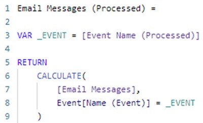
This measure is the only measure that needs to be used if the report is configured to display Email Messages segmented by Event. However, if you simply want to use separate measures for each Event, then the following additional measures may be used.
To calculate the unique number of Email Messages that were Processed.
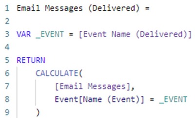
To calculate the unique number of Email Messages that were Delivered.
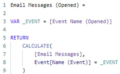
To calculate the unique number of Email Messages that were Opened.
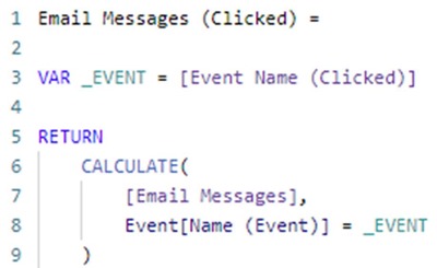
To calculate the unique number of Email Messages that were Clicked.
Step 3: Configuration – Calculation Group
This is the part of the configuration that really makes these examples work without the need to write multiple versions of each measure based on which relationship from Date to Email Events is used.
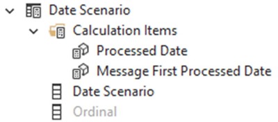
I have added a Calculation Group named Date Scenario to the data model. This Calculation Group contains two Calculation Items. One for each of the two relationships from Date to Email Events. In addition, I have renamed the Name column for this Calculation Group to Date Scenario.
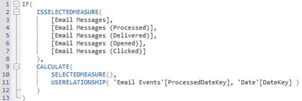
The Processed Date calculation item modifies any measure in the report to use the Date to Email Events ProcessedDateKey date relationship.
This alternate version modifies only those measures identified using the ISSELECTEDMEASURE() function.
The Message First Processed Date calculation item modifies any measure in the report to use the Date to Email Events MessageFirstProcessedDateKey date relationship.
This alternate version modifies only those measures identified using the ISSELECTEDMEASURE() function.
Step 4: Configuration – Report
The configuration of the visualisations in the report is straightforward and can be completed in one of the following four ways.
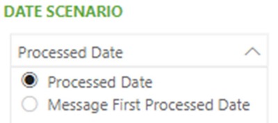
Firstly, the Date Scenario column from the Calculation Group can be added to a Slicer. Then ensure that the slicer is configured as a single-select slicer, a default option is selected, and the visual interactions between the slicer and visualisations on the report page are correctly configured based on whether the slicer should interact or not interact with the visualisation.
Secondly, the Date Scenario column from the Calculation Group can be added to the list of filters for a specific visualisation in a report using the ‘Filters on this visual’ pane. This ensures that the selected Date Scenario is applied to the visualisation.
Thirdly, the Date Scenario column from the Calculation Group can be added to the list of filters for a specific page in a report using the ‘Filters on this page’ pane. This ensures that the selected Date Scenario is applied to all the visualisations on the page.
Fourthly, the Date Scenario column from the Calculation Group can be added to the list of filters for the report using the ‘Filters on all pages’ pane. This ensures that the selected Date Scenario is applied to all the visualisations in the report.
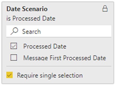
Importantly, for each of the previous three methods, you must ensure that the filter is configured to ‘Require single selection’, a default option is selected, and configure whether the filter is locked or not based on whether users are permitted to change the filter when using the report.
Summary
This article demonstrates how a Calculation Group may be used to change which relationship is used by a measure when it is executed. This approach reduces the number of measures that need to be written. Instead of writing one measure for each relationship, only one measure is required because the Calculation Group, containing a Calculation Item for each relationship, is used to filter the measure as required.
When the Calculation Group is used as a filter, the selected Calculation Item modifies the measures that are included in the visualisations. The Calculation Items do this using the DAX USERELATIONSHIP() function.
The Calculation Items can be configured to modify either all measures or only specific measures. Using the DAX SELECTEDMEASURE() function only specific measures identified using the DAX ISELECTEDMEASURE() function will be modified.


