How to configure a Top X Slicer in Power BI
Colin Maitland, 13 May 2022
In this article, I will demonstrate how to configure a slicer and related visualisation, such as a table or chart, to dynamically select and display the Top X Customers based on a measure such as Won Revenue in a Power BI report. The pattern demonstrated in this article can be adapted to suit your business requirements and use cases.
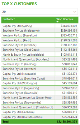
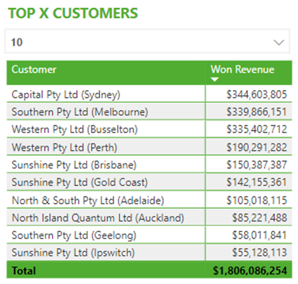
This image shows a table of the Top X Customers based on Won Revenue. The number of Customers displayed by the table is dynamically selected using the slicer.
Static Configuration
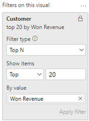
When configuring a Power BI visualisation, you can configure a visualisation such as a table or a chart to display the Top N Customers for a specific measure such as Won Revenue. This is accomplished by adding a Top N visualisation level filter to the visualisation, as shown in this image.
However, this configuration has a problem in that it is more static than dynamic. The Top N value cannot be changed to a different value by any report users who either do not have access to view or edit or do not know that they can or how to view and edit this visualisation level filter. For instance, this could be because the filters pane is hidden or the filter is locked. For this reason, I consider this configuration to be static rather than dynamic. In addition, this filter cannot be dynamically changed using a measure to set the Top N value dynamically.
Dynamic Configuration
Instead of using the previously described static configuration, a slicer can be added to the report that allows any report user to dynamically select the number of Customers to display in the related visualisation. An example of this is shown in the very first image in this article.
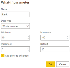
There are five steps to create a dynamic configuration. For this demonstration, I have chosen to complete each of these steps manually. However, Step 1, Step 2 and the first part of Step 5 can be completed automatically by adding a What-If-Parameter to your data model/report. You can do this from Power BI Desktop by navigating to Modeling, selecting New Parameter, completing the various options, and clicking Next. The following image shows the configuration options for such a What-if-parameter.
Step 1 – Parameter Table
This step requires adding a table that contains a list of values that can be displayed in the slicer that enables a report user to dynamically select how many Customers to display in the corresponding visualisation that displays the Top X Customers.
I have created this table using DAX, as shown here.
I have chosen to name the table ‘Rank’.
I have used the GENERATESERIES() function. You could also use the DATATABLE() function. Alternately, you could create this table using Power Query using a function such as List.Numbers() which is equivalent to the DAX GENERATESERIES() function.
I have chosen to generate a series of values from 10 to 100 in steps of 5. The resulting table contains a single column named Value. This image shows the contents of the first four rows of the table.
Step 2 – Selected Rank Measure
This step requires adding a measure that returns the currently selected or a default value from the slicer. This measure will be used by the Is Selected Customer Rank (Won Revenue) measure described in Step 4. Alternately, you can alter the measure in Step 4 to directly include this calculation rather than using this measure.
You can choose the name and home table for this measure. I have named this measure ‘Selected Rank’ and have chosen the Rank table as its home table.
I have created this measure using the DAX SELECTEDVALUE() function.
Step 3 – Customer Rank (Won Revenue) Measure
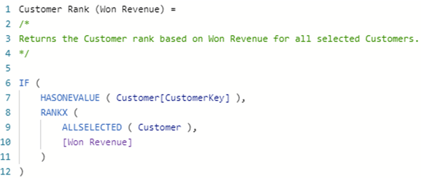
This step requires adding a measure that returns the ranking for each Customer displayed in a visualisation based on the measure used for ranking Customers, such as Won Revenue. This measure ranks each selected Customer against all other selected Customers. Those Customers with the most Won Revenue will be ranked more highly than those with the least Won Revenue. This measure will be used by the Is Selected Customer Rank (Won Revenue) measure described in Step 4. Alternately, you can alter the measure in Step 4 to directly include this calculation rather than using this measure.
You can choose the name and home table for this measure. I have named this measure ‘Customer Rank (Won Revenue)’ and have chosen the Customer table as its home table.
In this example, I have used the DAX HASONEVALUE(), RANKX() and ALLSELECTED() functions.
The use of the HASONEVALUE() function ensures that a rank is only calculated when there is only one Customer, identified using CustomerKey, selected for each row of the visualisation that displays the Top X Customers. For the same reason, this also prevents a rank from being calculated for total rows that display a total for multiple Customers.
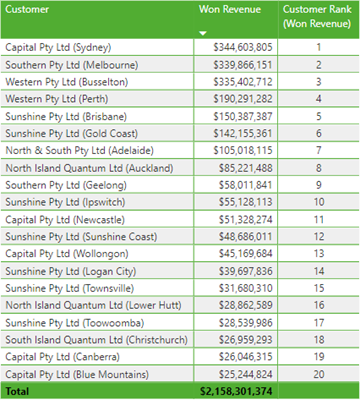
This image shows the results for this measure for 20 Customers.
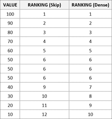
When using the RANKX() function, the values are affected by the optional <ties> parameter. In this example, I have chosen to allow RANKX() to use the default for this parameter, i.e. Skip rather than Dense, by not including the <ties> parameter. You might decide to include this parameter in your implementation and use Dense rather than Skip. Under certain circumstances, this will change how many Customers are displayed when selecting a Top X Value such as 10. The following table shows an example of the difference when calculating the ranking. If Skip is used by the RANKX() function, then ten rows will be selected, and if Dense is used by the RANKX() function, then twelve rows will be selected when using the calculation to display the Top 10 Customers.
Step 4 – Is Selected Customer Rank (Won Revenue)
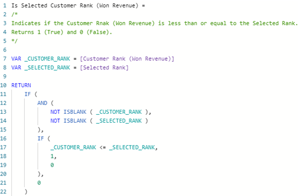
This step requires adding a measure that compares the Customer Rank (Won Revenue) with the Selected Rank. This measure compares the result returned by Customer Rank (Won Revenue) and Selected Rank measures. It then returns either 1 for True or 0 for False based on whether the Customer Rank (Won Revenue) is less than or equal to the Selected Rank. This measure will be used to filter the visualisation that displays the Customers dynamically.
You can choose the name and home table for this measure. I have named this measure ‘Is Selected Customer Rank (Won Revenue)’ and have chosen the Rank table as its home table.
Optionally, this measure could be configured to return True or False rather than 1 or 0.
Step 5 – Configure Slicer and Visualisation
The first part of this step is to add a slicer to the report that allows the user to select a value from the Rank table. You can optionally add a visualisation level filter on the slicer to configure which values the slicer displays. They do not need to be all the values from the Rank table. You should set the Single Select option on the slicer to On so that the User can only select one value at a time.
The second part of this step, if not already completed, is to add the visualisation, such as a table or chart, that displays the Customers and Won Revenue to the report. You need to ensure that only one Customer is displayed on each row or column.
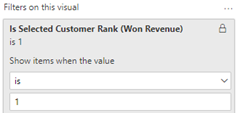
The third part of this step is to configure the visualisation to only display those Customers for which the result returned by the Is Selected Customer Rank (Won Revenue) measure returns a result of 1 (i.e., True). This step is completed by adding the Is Selected Customer Rank (Won Revenue) measure as a visualisation level filter to the visualisation as shown in the following image.
After completing these steps, the number of Customers displayed by the visualisation can now be dynamically changed using the slicer. For example, if the Selected Rank is changed from 20 to 10, the visualisation will be automatically updated to display those Customers with a Customer Rank (Won Revenue) of 10 or less rather than 20 or less. In other words, to now display the Top 10 Customers rather than the Top 20 Customers. Apart from optionally displaying Won Revenue, the visualisation does not need to display any other measures, such as Customer Rank (Won Revenue), described in this article for this dynamic configuration to work.
Summary
In this article, I have demonstrated the steps to configure a visualisation for Top X Customers so that a report user can dynamically change the number of Customers displayed by the visualisation. These steps are simple to complete and only require the addition of one table and three measures to the data model, a slicer to the report and the configuration of a visualisation level filter on the visualisation that displays the Top X Customers.
Compared to the option of statically configuring a visualisation to display the Top X Customers, a dynamic configuration provides an improved user experience. This is relevant for report users who want to dynamically adjust how many Customers are displayed by a Top X Customers visualisation and who either do not have access, cannot view or edit, or do not know how to view or edit visualisation level filters such as that used for the static configuration.
Finally, the pattern described in this article can be adapted for your business requirements and use cases.

