Configure Power BI Line and Stacked Column charts for Targets
Colin Maitland, 26 July 2021
In this article, I will demonstrate how to configure a Line and Stacked Column chart in a Power BI report to display Won Revenue and Open Revenue against Sales Targets and Target Remaining for Opportunities from Dynamics 365. This demonstration highlights a useful approach for using this type of chart that informs users of what the target is, what has been achieved, what is yet to be achieved to reach the target, and whether it is possible for the target to be achieved or exceeded.
Won Revenue, Open Revenue, Target, Target Remaining Chart
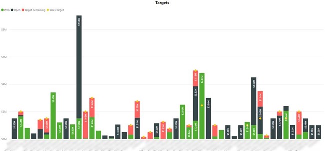
The following image shows an example of such a chart. One column is displayed for each Customer. This chart displays:
· Green: Won Revenue
· Black: Open Revenue; i.e. Estimated Revenue for Open Opportunities
· Yellow: Sales Target
· Red: Sales Target Remaining
Not all Customers have a Sales Target. Therefore, some of the columns do not display a Sales Target or Target Remaining.
The combined height of the Won Revenue and Open Revenue indicates what will be achieved if the Open Opportunities are closed as Won. Sometimes, this is less than the Sales Target, and sometimes this is greater than or equal to the Sales Target. If less than the Sales Target, then this indicates that there are not enough Open Opportunities in the Sales Pipeline for that Customer to meet the Sales Target.
You will notice that even though this is a Line and Stacked Column Chart, the chart has been configured not to display a line between the Sales Targets because the Sales Targets from one Customer to the next are not related.
Visually:
· If the red part of a column is touching the Sales Target, the Sales Target will not be reached because there are not enough Opportunities in the Sales Pipeline.
· If the green part of a column is touching the Sales Target, then the Sales Target has been reached or exceeded.
· If the black part of a column is touching the Sales Target, then the Sales Target is not yet reached, but can be reached if the Open Opportunities in the Sales Pipeline are closed as Won.
· If the black part of a column is higher than the Sales Target, then the Sales Target will be exceeded if the Open Opportunities are in the Sales Pipeline are closed as Won.
Targets Configuration
In this implementation, the Targets have been defined in Dynamics 365 using a custom Targets entity that allows Quarterly Targets to be configured on a Customer by Fiscal Year by Metric basis. Only one set of Quarterly Targets needs to be created per Customer by Fiscal Year by Metric. In the Power BI data model these have been de-normalised into a Targets table that has a separate row for each Customer by Metric by Quarter.
The standard Goals functionality in Dynamics 365 might also be used to configure Targets. However, in this implementation it was more straight forward to use a custom entity that only requires one Target record rather than four separate Goal records to be created per Customer per Metric per Quarter.
A custom entity can also be used if needing to configure Monthly Targets. In that case a custom Targets entity, with twelve Months, can be configured to configure Monthly Targets with the creation of a single Target record rather than twelve separate Goal records per Customer per Metric per Month.
Stacked Column and Line Chart Configuration
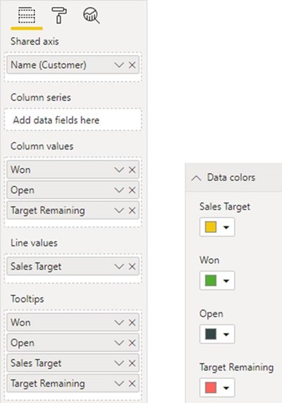
Getting back to the chart. Here is the configuration of the Column and Line values displayed in the chart. You will notice that there are four values. These are Won Revenue, Open Revenue, Sales Target and Target Remaining.
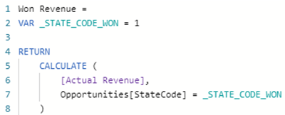
· The Won Revenue is a calculation of the Actual Close Date aligned Actual Revenue for Won Opportunities.
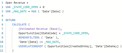
· The Open Revenue is a calculation of the Created On Date aligned Estimated Revenue for Open Opportunities. Depending on business requirements, this could be calculated as Estimated Close Date aligned Estimated revenue for Open Opportunities. The Created On Date alignment is used in this implementation because an Opportunity could actually be closed as Won before its Estimated Close Date. The [Estimated Revenue (Base)] measure aligns the Estimated Revenue with the Created On Date of the Opportunity.
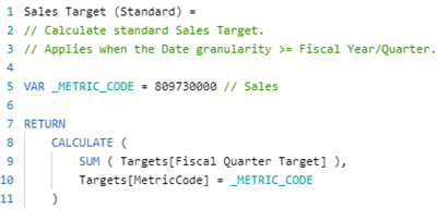
· The Sales Target is the sum of Target values for the selected Quarters.
· The Target Remaining is the difference between the Won Revenue and the Sales Target, but only if the Sales Target is greater than the Won Revenue.
As previously mentioned, a yellow diamond is displayed for the Sales Target, and the chart has been configured not to display a line between the Sales Targets. The configuration is accomplished by:
· Adding the Sales Target to the chart as a Line Value.
· Setting the Data Colour for the Sales Target series to yellow.
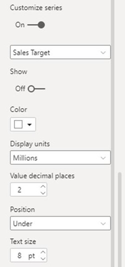
· Optionally, selecting Customise Series on the Data Label properties, selecting the Sales Target, and then turning off Show so that the Data Label for the Sales Target is not displayed on the chart.
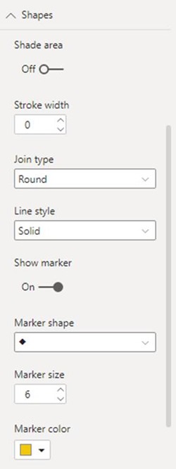
· Configuring the Shapes properties as shown in the following image. This especially includes setting the Stroke Width to 0 to hide the Line, turning on Show Marker, and setting the Marker Shape, Marker Size and Marker Colour. In particular, setting the Stroke Width to 0 hides the display of a line and turning on Show Marker displays a shape such as a diamond.
· The Marker Colour should be set to the same colour the Data Colour for the Sales Target. This ensures that the correct colour is displayed in the Legend of the chart.
Conclusion
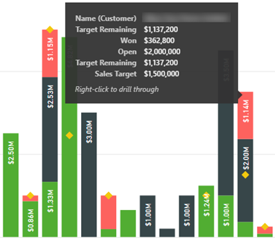
Here is the resulting chart. One column is displayed for each Customer.
In conclusion, in this article, I have demonstrated how to configure a Line and Stacked Column Chart to display progress toward targets in a way that highlights to users of the report what the target is, what has been achieved, what is yet to be achieved to reach the target and whether it is possible for the target to be achieved or exceeded.


![clip_image008[1] clip_image008[1]](https://magnetismwebsite.blob.core.windows.net/blogfiles/colinmaitland/ece7ae68-34cf-4ca1-9fa8-e566f079b71c-Open-Live-Writer/cdf6d0258b32_972E/clip_image008[1]_thumb.png)
