A Tale of Two Countries - Charting Covid-19 Growth Rates with Power BI
Colin Maitland, 23 April 2020
Power BI is a great tool for analysing information. In this article, I demonstrate some charting approaches using some standard Power BI charts. The three examples of chart-sets in this article demonstrate my lay persons analysis of a ‘Tale of Two Countries’; i.e. comparison of the reported Covid-19 growth rates between New Zealand and Australia. As such, these should not be used for official reporting or decision-making purposes.
The source data used is directly retrieved using Power BI from a csv file provided by the European Centre for Disease Prevention and Control (downloadable datasets available here).
It is important to understand that the cases in this source data are reported new cases. For many reasons not covered by this article reported new cases is not the same as actual new cases.
Using this source data, I created a Power BI data model containing relevant dimension and fact tables, relationships, calculated fields and measures. I then created the three chart-sets using standard Power BI charts.
The data displayed by each of the charts start from 1st March 2020 to today (at time of writing), so that the starting and ending Dates on the X (horizontal) axis for all charts are aligned. An alternative approach would be to chart the Covid-19 growth rates against ‘Days Since 1st Reported Case’ instead of against the Calendar date.
Example 1
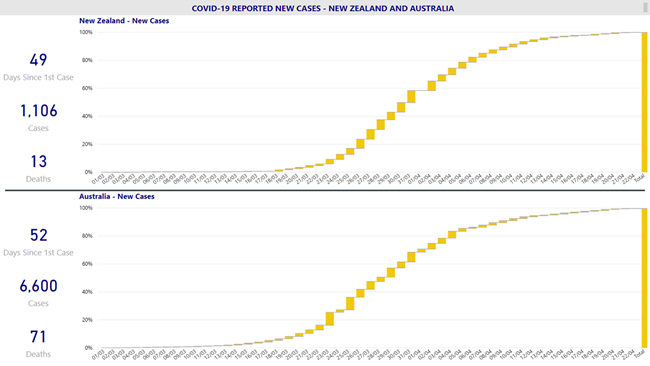
The charts on this page are waterfall charts. These charts plot a growth curve and daily incremental increase as a percentage of total reported new cases. The comparison between New Zealand and Australia is made more informative by the fact that the percentage of total new cases is charted rather than actual number of new cases. This removes the differences in magnitude for new cases and total cases between the two countries. (Click the image to enlarge).
For all the chart-sets and charts demonstrated in this article, the choice and use of headings and titles inform the person viewing the charts what the content of each one is.
In addition, the colours have been chosen for their meaning and visual clarity. Yellow is commonly used to identify contaminated materials. Therefore its use here as the primary colour is somewhat appropriate. However, in reality, rather than these charts displaying an analysis of contaminated marterials they are displaying an analysis of reported new cases of people who have been infected with Covid-19. The two are not the same.
A small selection of complementary colours is then also used for the other chart elements. This combination and use of colours enhance visual clarity; e.g. the number of colours used is small and the use of red and green have been avoided. Red-Green is a common colour-blindness combination, especially among men. Blue-Yellow is also a colour blindness combination but is rare. In comparison, often with Red-Green colour blindness blues and yellows stand out.
Example 2
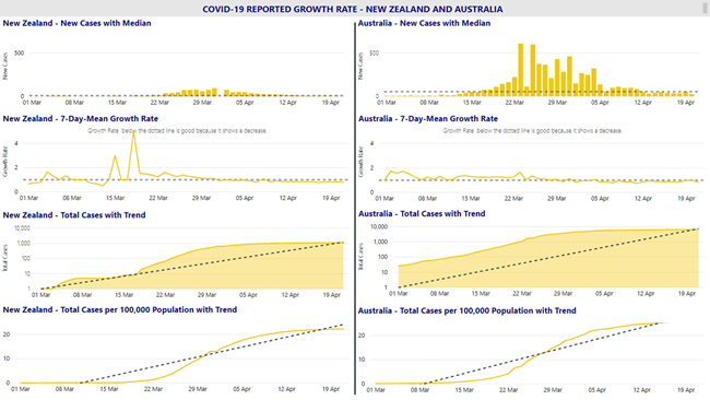
The charts on this page are clustered column charts, area charts and line charts. In general, a comparison of the heights, angles and slopes of the bars and lines on these charts convey more information than the values displayed on the Y (vertical) axis of the charts. The Median, Trend and Constant lines have been added to the charts using the Power BI Analytics Median Line, Trend Line, and Constant Line chart options. (Click the image to enlarge).
Several approaches have been used to enhance the presentation of these charts for clarity and comparison purposes:
- Charts that display the same analysis are aligned next to each other; e.g. Australia versus New Zealand.
- In addition to the dates displayed on the X (horizontal) axis being aligned, the values displayed on the Y (vertical) axis of each pair of charts are aligned.
- The use of a logarithmic scale rather than a linear scale for the ‘Total Cases with Trend’ charts provide a more informative comparison between New Zealand and Australia given the magnitude in difference between the number of reported new cases between these two countries. A variant and more informative comparison is presented in the ‘7-Day Mean Growth Rate’ and ‘Total Cases per 100,000 Population’ charts. The bottom three sets of charts in this chart set are useful for planning purposes when combined with other information such as recovery rates, death rates, and healthcare capacities.
- The reported growth rate on each chart is complimented with a comparison value such as a Median, Trend, or Constant Line. Such comparison provides additional understanding and insight.
Example 3
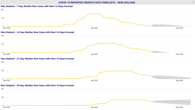
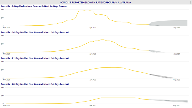
These charts demonstrate the use of the Power BI Analytics Forecast option. They demonstrate a comparison of the Power BI generated 14-Day Forecasts based on calculated 7-Day, 14-Day, 21-Day and 28-Day medians. These forecasts do not take into account all the real-world factors that need to be considered such as data quality, infectivity characteristics, recovery rates, death rates, healthcare capacity/quality, and infection control measures such as public hand-washing and social distancing. Because of the simplicity of the calculations used and the absence of inclusion of all relevant real-world factors, these forecasts are not accurate. However, what is interesting is how much the number of days included in the median calculation affects the Forecast generated by Power BI. (Click the images to enlarge).
In conclusion, the purpose of this article has been to demonstrate the configuration of some standard Power BI charts in ways that enhance the clarity, understanding and insight of the information presented. This has consisted of the inclusion and use of titles, headings and colours; the alignment of related charts and their X (horizontal) and Y (vertical) axis; the use of linear and logarithmic scales; and the plotting of actual and percentage values. The quality of the information displayed by each chart was also enhanced by including a point of comparison such as a Median, Trend, Constant or Forecast.


