

Power BI Microsoft Dynamics CRM Online – Power Map Report Part 3
Colin Maitland, 19 July 2015
In this series of blogs I have been describing how to create Power BI reports in Microsoft Excel based using data from a Microsoft Dynamics CRM Online Organisation.
In my previous blog I demonstrated how to configure the second layer of a Power Map report in Microsoft Excel to display Account Revenue segmented by City as Stacked Column charts. In this blog I will finish by demonstrating how to configure a third layer on this Power Map report to display Opportunity Value, i.e. Actual Value and Estimated Value, segmented by City as Bubble charts.
- If required, open the Microsoft Excel workbook and then open the Power Map report by selecting Launch Power Map from the Power Map button on the INSERT tab of the ribbon bar. When prompted, double-click the previously created Power Map report to open it.

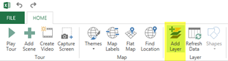
- To add a third Layer to the Power Map report, click the Add Layer button on the HOME tab of the ribbon bar.
- Rename Layer 3 as follows:
- Click the Edit icon to the right of the Layer 3 name field and rename it to something such as Opportunity Value

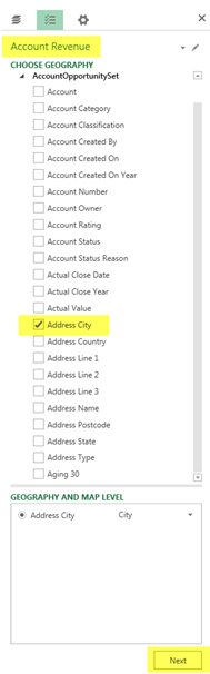
- Geographically segment the Opportunity Revenue layer by selecting the Address City, or equivalent field, from the list of fields and then click Next to continue.
- Change the Chart Type for the Opportunity Revenue layer, in this example to a Bubble chart, as follows:
- Select the Bubble chart type icon from the list of Chart Types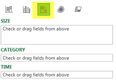
- Select the Actual Value and Estimated Value, or equivalent fields, from the list of fields so that the Bubble charts displayed on the Power Map report are summarised by Account Value and Estimated Value.
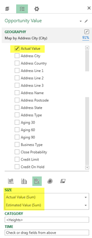
- Click the Settings button and configure the Layer Options as follows:
- Set the Opacity to 50%
- Actual Value (Sum) Colour to green
- Estimated Value Colour to orange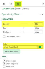
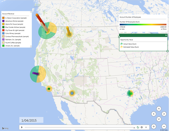
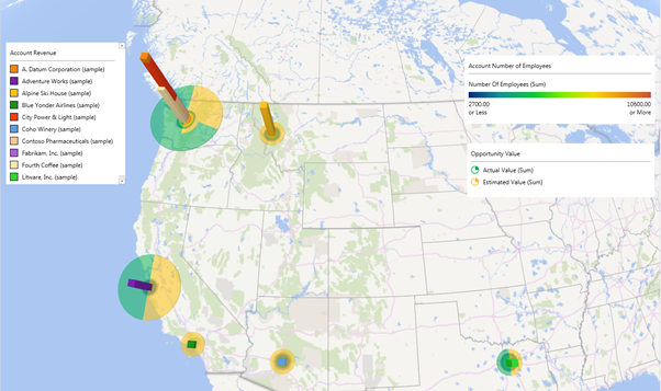
- The Power Map report now looks similar to the following. As a result of configuring this layer an Account Revenue legend has also been added to the report.
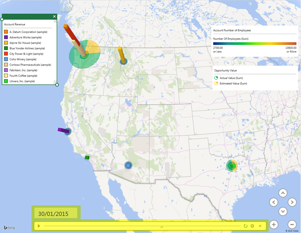
- Finally you may like to drag-and-drop the Actual Close Date, or equivalent field, form the list of fields into the TIME area on the Layer Pane to enable the Power Map to display an animated of Opportunity Value by Actual Close Date.

Category List

Filter by Author
Adam Murchison
Alfwyn Jordan
Arthur Mandisodza
Calum Jacobs
Colin Maitland
David Mochrie
Dominic Liu
Gayan Perera
Harshani Perera
Isaac Stephens
Jaime Smith
Jared Johnson
John Barrencechea
John Eccles
Lauren Withers
Paul Nieuwelaar
Roshan Mehta
Roz Millar
Ryan Blaikie
Ryan Ingram
Sarah Coleman
Sean Roque
Shalane Williams