

Power BI Microsoft Dynamics CRM Online – Power Map Report Part 1
Colin Maitland, 17 July 2015
In this series of blogs I have been describing how to create Power BI reports in Microsoft Excel based using data retrieved from a Microsoft Dynamics CRM Online Organisation using a Power Query query.
In this blog I will demonstrate how to create a Power Map report and configure the first layer to display Account Employees segmented by City as Heat Map charts.
This demonstration uses a Microsoft Excel workbook that contains a previously created AccountOpportunitySet query created using Power Query.
- If required, open the Microsoft Excel workbook.
- Select Launch Power Map from the Power Map button on the INSERT tab of the ribbon bar.
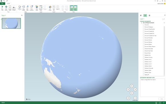
- From the Launch Power Map dialog click New Tour.

- A blank Power Map report will now be displayed. The left-hand Tour Editor pane and the right-hand Layer pane can be displayed or hidden by clicking the Tour Editor and Layer Pane buttons on the HOME tab of the ribbon bar. In this example the Layer Pane is displaying the AccountOpportunitySet query created previously and described in my earlier blogs of this series.
- Rename the Power Map report as follows:
From the left-hand Tour Editor pane select the Tour 1 name field and change the name to something such as Accounts Opportunities Map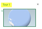

- Rename Layer 1 as follows:
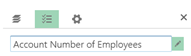
Click the Edit icon to the right of the Layer 1 name field and rename it to something such as Account Number of Employees.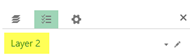
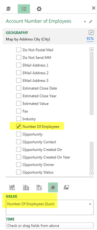
- Geographically segment the Account Number of Employees layer by selecting Address City, or equivalent field from the list of fields and then click Next to continue.
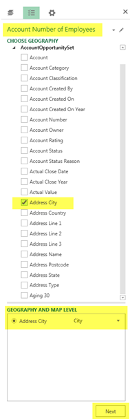
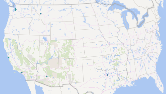
- The Power Map report will now display data points for the Cities contained in the AccountOpportuntySet. You may choose to geographically segment by other geographical segments such as State or Country, however, in this example segmenting by City gives the best result.
In this example, the GEOGRAPHY pane for the Account Number of Employees layer show that there is a 91% level of confidence in matching Cities using the Address City field.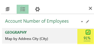
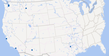
Clicking the hyperlink opens a Mapping Confidence report as shown in the following image: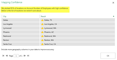
You can change the geographical segmentation by clicking the Edit button and then other geographical fields such as Address Country instead of the Address City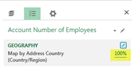
- Change the Chart Type for the Account Number of Employees layer, in this example to a Heat Map, as follows:
Select the Heat Map chart type icon from the list of Chart Types. Notice that the properties for this chart type are VALUE and TIME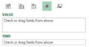
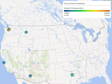
- The data points displayed on the Power Map report are now displayed as Heat Maps.
- To update the Heat Maps to display the Sum of Number of Employees by City select the Number of Employees field from the list of fields. This results in Number of Employees (Sum) being added to the VALUE area of the Layer Pane.
- The map is also updated and now contains an Account Number of Employees legend for the Heat Maps displayed on the Power Map report.
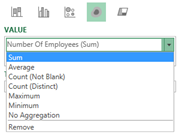
- Optionally you can change the aggregate for Number of Employees by City from Sum to something else such as Average by selecting one of the aggregate options from the drop down list.
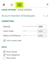
- To finish the configuration of this layer of the Power Map report, click the Settings icon and configure any of the Layer Options, such as Opacity or Lock current scale, to suit your preferences.
In my next blog I will demonstrate how to add a second layer to display the Account Revenue as Stacked Column charts on the Power Map report.
Category List

Filter by Author
Adam Murchison
Alfwyn Jordan
Arthur Mandisodza
Calum Jacobs
Colin Maitland
David Mochrie
Dominic Liu
Gayan Perera
Harshani Perera
Isaac Stephens
Jaime Smith
Jared Johnson
John Barrencechea
John Eccles
Lauren Withers
Paul Nieuwelaar
Roshan Mehta
Roz Millar
Ryan Blaikie
Ryan Ingram
Sarah Coleman
Sean Roque
Shalane Williams