

Power BI Microsoft Dynamics CRM Online – PivotChart Report Part 3
Colin Maitland, 03 June 2015
In my previous blog I demonstrated how to convert a Column Chart that displays the Sum of Estimated Value by Account into a Pie Chart. In this blog I will demonstrate how to update the Column Chart to display both the Sum of Estimated Value and the Sum of Actual Value. I will also demonstrate how to change the column colours and how to change the chart from a Clustered Column Chart to a Stacked Column Chart.
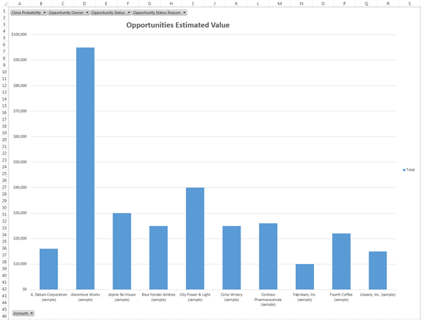
The following image shows the Column Chart with only the Sum of Estimated Value by Account displayed. The Accounts are displayed on the X (CATEGORIES) axis and the Sum of Estimated Value is displayed on the Y (SERIES) axis. The chart is filterable by Account, Close Probability, Opportunity Owner, Opportunity Status and Opportunity Status Reason using the filter controls displayed on the chart area.
To update this chart so that it displays both Sum of Estimated Value and Sum of the Actual Value by Account, complete the following steps:
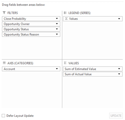
- If required, select the Chart to activate the Pivot Chart Tools tabs on the ribbon bar. Click the Field List button in the Show/Hide group on the ANALYZE tab to display the PivotChart Fields pane.
- From the PivotChart Fields pane drag-and-drop the Actual Value field into the VALUES area:
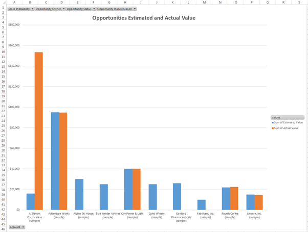
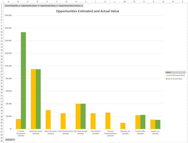
The chart will now be updated to look similar to the following. The blue column displays the Sum of Estimated Value and the orange column displays the Sum of Actual Value by Account. The Legend displays the definitions for each colour.
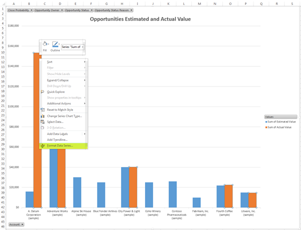
Optionally, you may change the colours used. For example change the colour for the Sum of Actual Value from Orange to Green and the colour for Sum of Estimated Value from Blue to Orange, by completing the following steps:
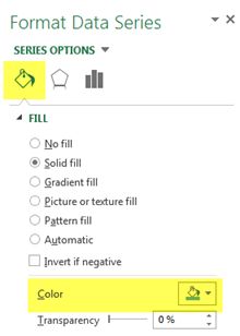
- Right-click on any Sum of Actual Value column and select Format Data Series… from the list of popup-menu options:
- On the Format Data Series pane select the Fill icon and change the Color option from orange to green:
- Right-click on any Sum of Estimated Value column and select Format Data Series… from the list of popup-menu options.
- On the Format Data Series pane select the Fill icon and change the Color option from blue to orange.
The chart will now look similar to the following where the colour orange now represents the Sum of Estimated Value and the colour green represents the Sum of Actual Value.
The Accounts are currently displayed in Alphabetical Order, however, you may also like to order the Accounts by State by completing the following steps:
- If required, select the Chart and click the Field List button on the ANALYZE tab of the ribbon bar to display the PivotChart Fields pane.
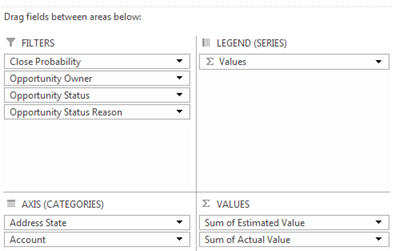
- From the PivotChart Fields pane drag-and-drop the Address State, or equivalent, field into the AXIS (CATEGORIES) area ensuring that it is positioned before the Account field:
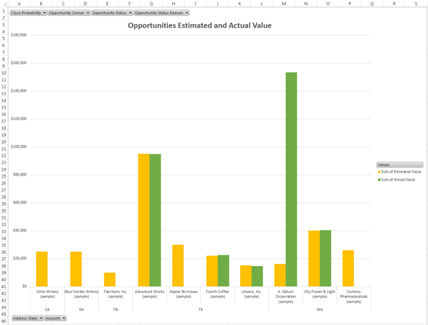
The Chart will now be updated to display the Accounts by State.
Finally you may want to convert the chart from a Clustered Column Chart to a Stacked Column Chart by completing the following steps:
- Right-click on the Plot Area of the Chart and select Change Chart Type… from the list of popup-menu options:
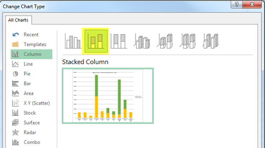
- From the Change Chart Type dialog select the Stacked Column Chart Type and then click OK.
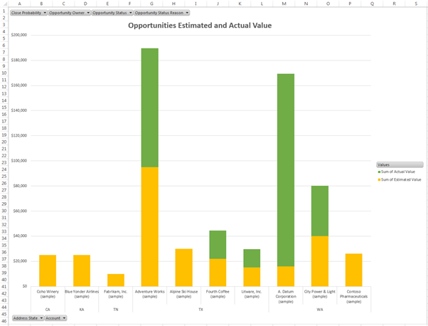
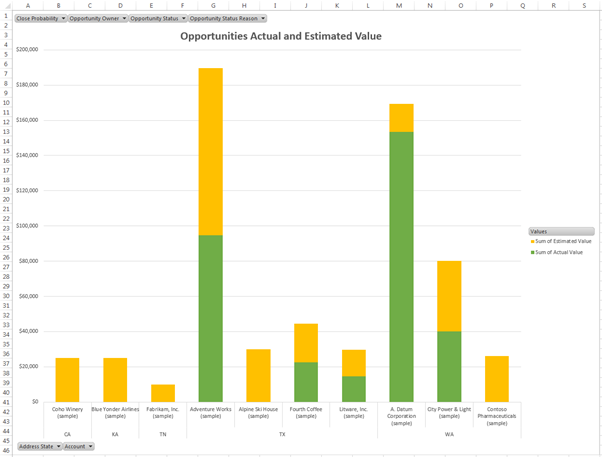
The chart will now be updated to display the Sum of Estimated Value and Sum of Actual Value by Account using Stacked rather than Clustered columns. However, it is more meaningful to display the Actual Value prior to the Estimated Value on this type of chart and so the following final steps should also be completed:
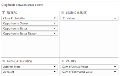
- If required, select the Chart and click the Field List button on the ANALYZE tab of the ribbon bar to display the PivotChart Fields pane.
- From the PivotChart Fields pane, reposition the Sum of Actual Value and Sum of Estimated Value in the VALUES area using drag-and-drop so that Sum of Actual Value is positioned before Sum of Estimated Value.
The chart will now be updated to display the Actual Value prior to the Estimated Value and will look similar to the following:
Category List

Filter by Author
Adam Murchison
Alfwyn Jordan
Arthur Mandisodza
Calum Jacobs
Colin Maitland
David Mochrie
Dominic Liu
Gayan Perera
Harshani Perera
Isaac Stephens
Jaime Smith
Jared Johnson
John Barrencechea
John Eccles
Lauren Withers
Paul Nieuwelaar
Roshan Mehta
Roz Millar
Ryan Blaikie
Ryan Ingram
Sarah Coleman
Sean Roque
Shalane Williams