

Power BI Microsoft Dynamics CRM Online – PivotChart Report Part 2
Colin Maitland, 29 May 2015
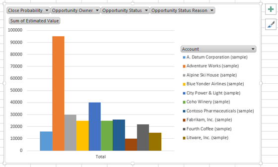
In my previous blog I demonstrated how to create a simple Clustered Column Chart in Microsoft Excel that displays the Sum of Estimated Revenue by Account using data queried from a Microsoft Dynamics CRM Online Organisation.
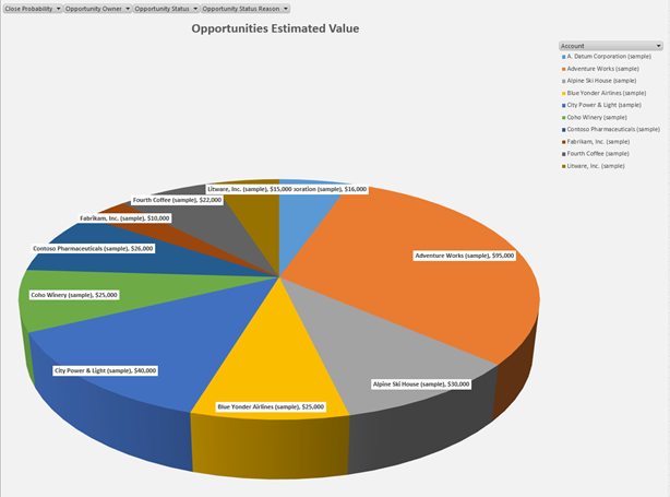
In this blog I will demonstrate how to convert this chart into a 3D Pie Chart categorised by Account and how to add and format the Chart Title and Data Labels.
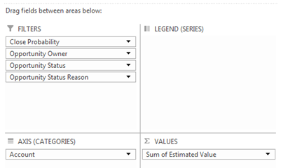
To convert the Column Chart to a Pie Chart the Accounts field displayed in the chart configuration must first be moved from the LEGEND (SERIES) area to the AXIS (CATEGORIES) area so that each segment of the Pie Chart represents an Account.
Step-By-Step
- Drag-and-drop the Account field from the LEGEND (SERIES) area into the AXIS (CATEGORIES) area.
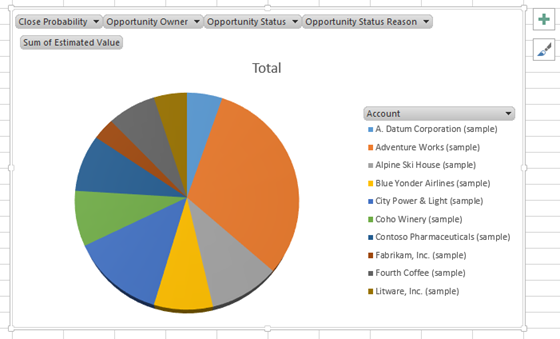
The chart will now look similar to the following: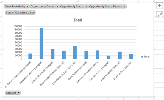
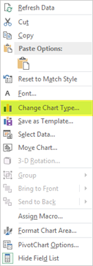
- To change the Chart Type to a 3-D Pie chart, right-click on the chart control and select Change Chart Type… from the list of pop-up menu options.
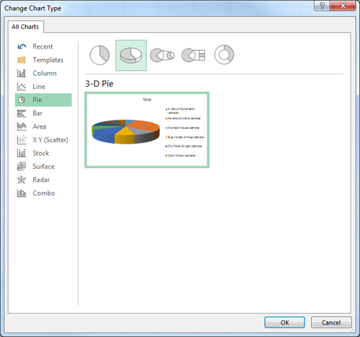
- From the Change Chart Type dialogue select Pie from the list of Chart Types and select 3-D Pie and then click OK.
The chart will now look similar to the following:
4. Reposition and resize to suit your preferences by selecting the chart and/or chart borders and using drag-and-drop to then reposition or resize the chart. 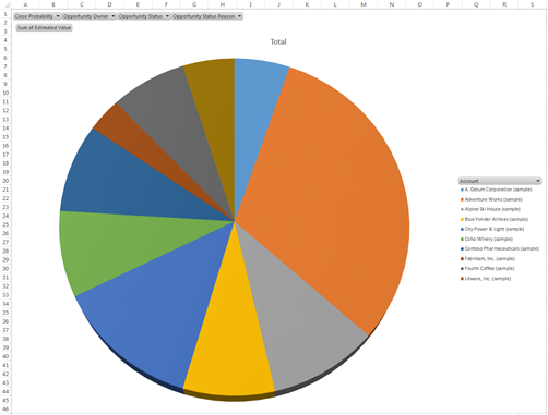
5. To change the Chart Title from Total to something else such as Opportunities Estimated Value, double-click the Chart Title field and edit it. Use the Font controls on the HOME tab of the ribbon bar to format the Chart Title to your preferences for Font, Size, Colour and Style. 
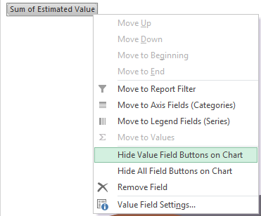
6. To hide the Value Field button on the chart, right-click the Sum of Estimated Value button and select Hide Value Field Buttons on Chart from the list of pop-up menu options.
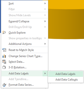
7. To display a Data Label on each segment of the chart, right-click on any segment and select Add Data Labels from the list of pop-up menu options.
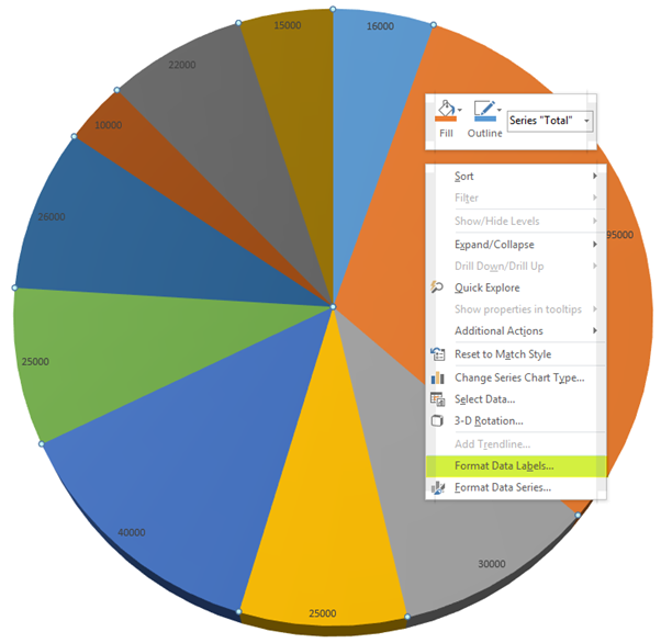
8. To format the Data Labels displayed, right-click any of the Data Labels and select Format Data Labels from the list of pop-up menu options.
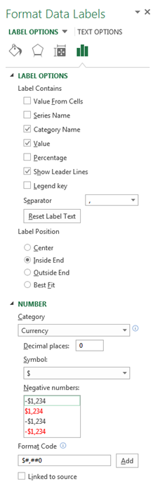
9. From the Format Data Labels… pane configure the LABEL OPTIONS and Label Position to your preferences; e.g. ensure the Category Name and Value options are selected and the Label Position option is set to Inside End. Configure the NUMBER, e.g. ensure Category is set to Currency and Decimal Places is set to 0. Use the Font controls on the HOME tab of the ribbon bar to format the Data Labels to your preferences for Font, Size, Colour and Style.
10. To rotate the pie-chart, right-click on the pie-chart and select 3-D Rotation from the list of pop-up menu options. From the Format Chart Area pane, configure the 3-D Rotation options to suit your preferences; e.g. set the Y-Rotation to 30%.
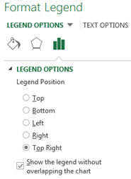
11. To reposition the Legend, right-click on the Legend and select Format Legend… from the list of pop-up menu options. From the Format Legend pane select LEGEND OPTIONS to suit your preferences; e.g. Set Legend Position to Top Right.
12. To format the Legend, select the Legend and then use the Font controls on the HOME tab of the ribbon bar to format the Legend to your preferences for Font, Size, Colour and Style.
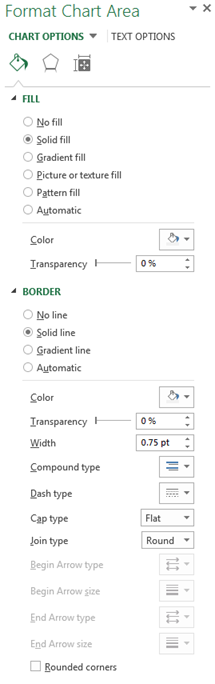
13. To format the Chart Area, right-click on the Chart Area and select Format Chart Area… from the list of options displayed on the pop-up menu. From the Format Chart Area pane select FILL and BORDER options to suit your preferences; e.g. Set Fill to Solid Fill and Colour to a selected shade of Grey.
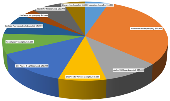
As a result of completing these steps, the Opportuities Estimated Value Clustered Column Chart has been converted to a 3-D Pie Chart with the addition of additional elements and formatting, similar to the following:

In my next blog I will demonstrate how to update the original Clustered Column Chart to display both the Estimated Value and the Actual Value for Opportunities by Account as either a Clustered Column Chart or as Stacked Column Chart.
Category List

Filter by Author
Adam Murchison
Alfwyn Jordan
Arthur Mandisodza
Calum Jacobs
Colin Maitland
David Mochrie
Dominic Liu
Gayan Perera
Harshani Perera
Isaac Stephens
Jaime Smith
Jared Johnson
John Barrencechea
John Eccles
Lauren Withers
Paul Nieuwelaar
Roshan Mehta
Roz Millar
Ryan Blaikie
Ryan Ingram
Sarah Coleman
Sean Roque
Shalane Williams