

Power BI Microsoft Dynamics CRM Online – PivotChart Report Part 1
Colin Maitland, 26 May 2015
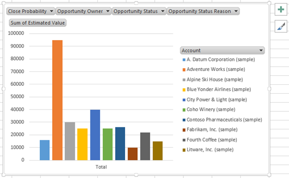
In this blog I will demonstrate how to create a simple Clustered Column Chart in Microsoft Excel to display Microsoft Dynamics CRM Online Sum of Estimated Value for Opportunities by Account. The chart is based on the AccountOpportunitySet query built using Power Query as demonstrated in the previous blogs in this series. This chart is filterable by Close Probability, Opportunity Value, Opportunity Owner, Opportunity Status and Opportunity Status Reason.
Step-By-Step
- Open a Microsoft Excel workbook that contains the AccountOpportunitySet previously created using Power Query.
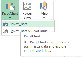
- Select PivotChart from the INSERT tab on the ribbon bar.
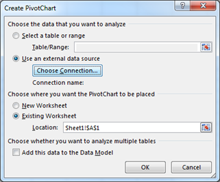
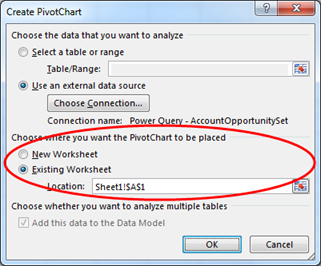
- From the Create Pivot Chart dialogue select the Use an external data source option and click Choose Connection.
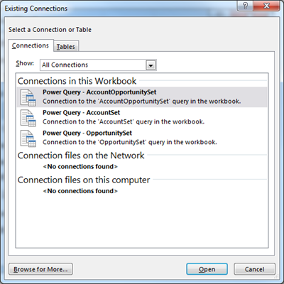
- From the Existing Connections dialogue, choose the Power Query – Account OpportunitySet from the list of Connections and click Open.
- From the Create PivotChart dialogue select the Worksheet onto which to place the chart and click OK.
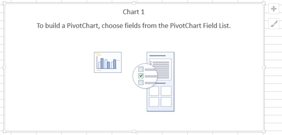
- The selected Worksheet will now display a PivotChart control and related PivotChart Fields pane. The PivotChart Fields pane displays a list of fields from the AccountOpportunitySet and a FILTERS, LEGEND (SERIES), AXIS (CATEGORIES) and VALUES areas onto which selected fields may be dragged-and-dropped in order to configure the chart. If the PivotChart Fields pane is not displayed locate and click the Field List button on the ANALYZE tab of the command bar to show it.
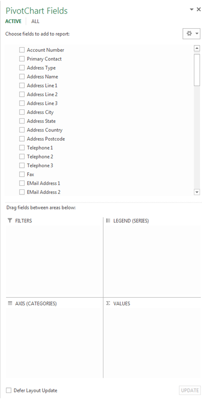
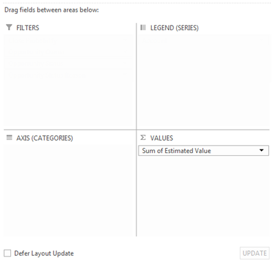
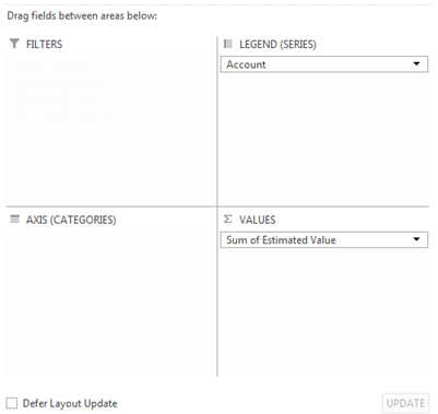
- To configure the chart to display the Sum of Estimated Value drag-and-drop the Estimated Value field from the Fields List into the VALUES area.
- To configure the chart to summarise the Sum of Estimated Value by Account drag-and-drop the Account field from the Fields List into the LEGEND (SERIES) area.
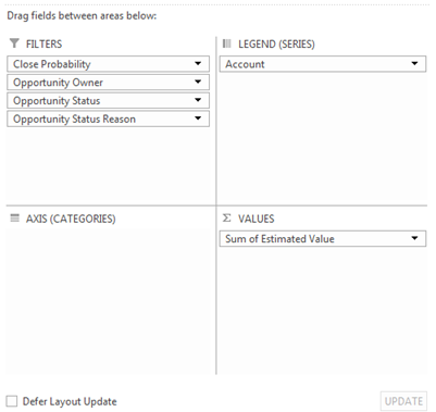
- To configure the chart so that it may be filtered by Close Probability, Opportunity Owner, Opportunity Status or Opportunity Status Reason, drag-and-drop these fields from the Fields List into the FILTERS area.
We now have a simple filterable Clustered Column Chart that displays the Sum of Estimated Value of Opportunities by Account.

In my next blog I will demonstrate how to convert this chart into a 3D-Pie Chart with additional formatting applied such as the addition of a Chart Title and Data Labels.
Category List

Filter by Author
Adam Murchison
Alfwyn Jordan
Arthur Mandisodza
Calum Jacobs
Colin Maitland
David Mochrie
Dominic Liu
Gayan Perera
Harshani Perera
Isaac Stephens
Jaime Smith
Jared Johnson
John Barrencechea
John Eccles
Lauren Withers
Paul Nieuwelaar
Roshan Mehta
Roz Millar
Ryan Blaikie
Ryan Ingram
Sarah Coleman
Sean Roque
Shalane Williams